 Letters
Guide Letters
The page came to me.
How three working transitions gave way to one better idea: keep the writing library in place and bring the article forward.
Publié
Just after midnight on Tuesday, September 1, 2026, I had a navigation problem that looked like an animation problem.
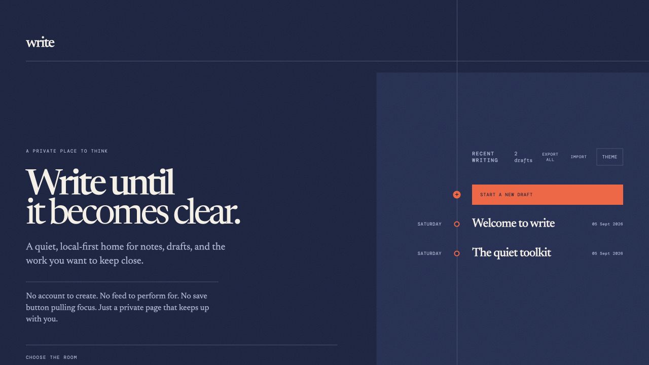
Clicking an article did exactly what a website was supposed to do: the library disappeared, the address changed, and the editor took its place. Nothing was broken. I simply disliked the small feeling of being sent away from the place where I had chosen what to write.
The timeline was more than a menu by then. It was the map of the work. Opening one draft should not have meant losing sight of the rest of it.
I tried to animate the goodbye
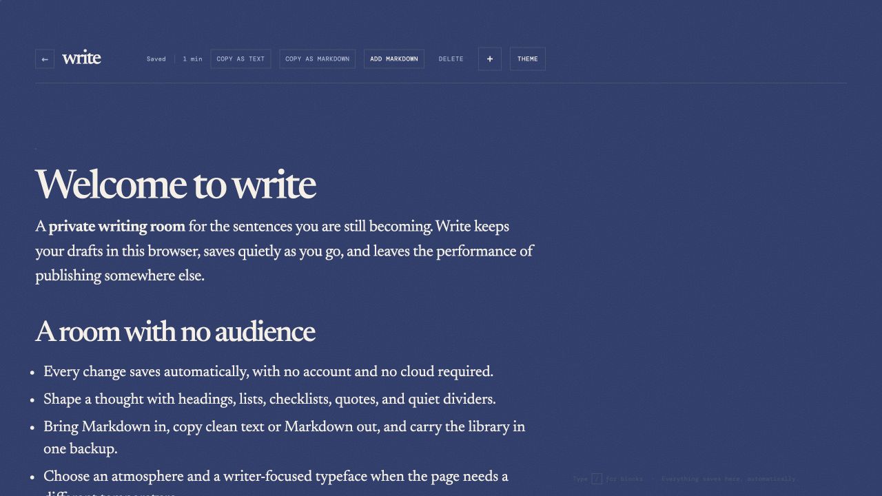
At 12:30 AM, I added a custom transition to smooth the trip from the timeline into an article. Seven minutes later, I fixed the return navigation. Forty minutes after that, I removed the custom machinery and rebuilt the movement with Vue’s native transitions.
Each version was cleaner than the one before it. The article faded and shifted in the right direction. The browser Back button behaved. Reduced-motion preferences were respected. It was becoming a very polished way to solve the wrong problem.
I was polishing the way out when I did not want to leave at all.
The useful mistake
The motion was smoother. The idea was still wrong.
A page transition could make leaving feel graceful, but it could not preserve the writer’s sense of place. The home and the editor still behaved like two separate destinations. I had been tuning the handoff instead of questioning why there needed to be a handoff.
At 1:30 AM, I stopped changing pages
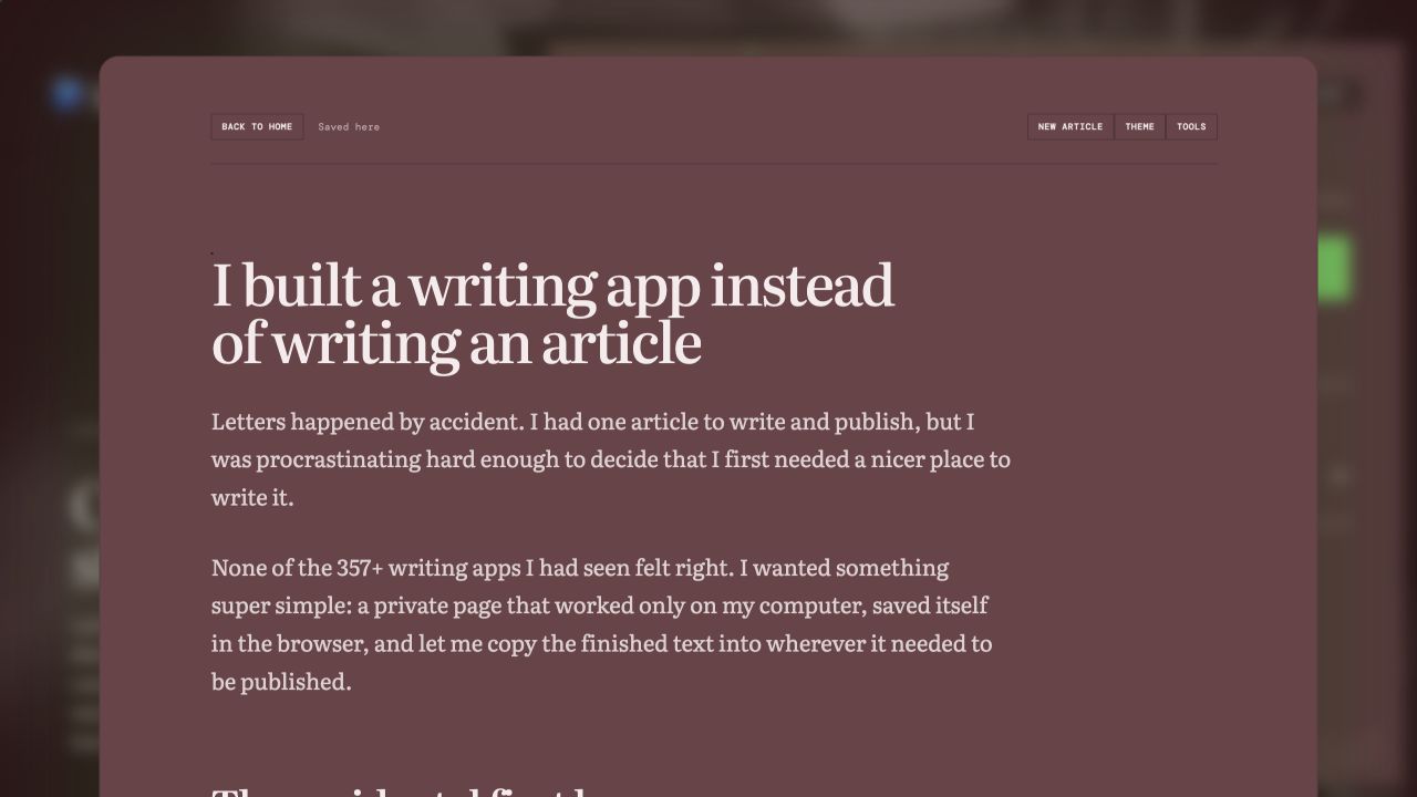
The next commit removed the page transitions entirely. Instead, the home kept its place and the article slid up from the bottom-right as a focused drawer. The library receded behind it—smaller, softer, still recognisable. The draft had come forward without making everything else vanish.
The first drawer used 77 percent of the desktop width and the full width on smaller screens. Direct article links still worked. Old bookmarks still opened. The visible change was simple, but it had to preserve all the quiet browser behaviour underneath:
- Open an article from the timeline without losing the timeline.
- Use Back to close it and Forward to bring it back.
- Open a direct article link into the same focused view.
- Start another article without dropping the current save.
- Remove the movement for anyone who preferred reduced motion.
The browser still had to remember
This was the part that made the small visual idea real. A drawer could not become a shortcut around navigation, history, saving, or readable links. It had to feel lighter while behaving like the solid page it replaced.
Eleven minutes later, I adjusted its inset and gave the writing more space. Eight minutes after that, the top controls learned to look like one family. The exact shape would keep changing over the next few days, but the relationship was settled: the library stayed, and the page came to the writer.
A better answer than smoother
In just under an hour, I had tried a custom transition, replaced it with a native one, and then removed the page transition altogether. None of that work was wasted. Each attempt made the actual discomfort easier to name.
Sometimes a stubborn animation is not asking for better easing. It is telling you the interaction is wrong.
The article no longer carried me away from the writing app. It opened inside the place where I had found it. For the first time, the app felt less like a collection of screens and more like one continuous thought.